Why karlovich.xyz looks the way it does
I wanted somewhere to write that read like a set page, not a product—part journal, part cabinet for the things I’m into (watches, space, homelab tinkering), somewhere to think out loud that anyone who stumbles in can read. Almost every choice about how the site looks falls out of that: a clear column to read down, room in the margin for the asides, and as little interface as I could get away with. Nothing on the page is asking you to do anything except read it, wander by a tag, and maybe pass a note along. 1“That’s just, like, your opinion, man.” —The Dude, The Big Lebowski
What it borrows
The layout is lifted, fairly directly, from Edward Tufte (Tufte, 2001): a generous measure, asides and metadata pushed into the margin instead of breaking the sentence, and a standing suspicion of anything on the page that isn’t earning its place. Links are underlined text rather than a second color system, and decoration only shows up where it carries information.
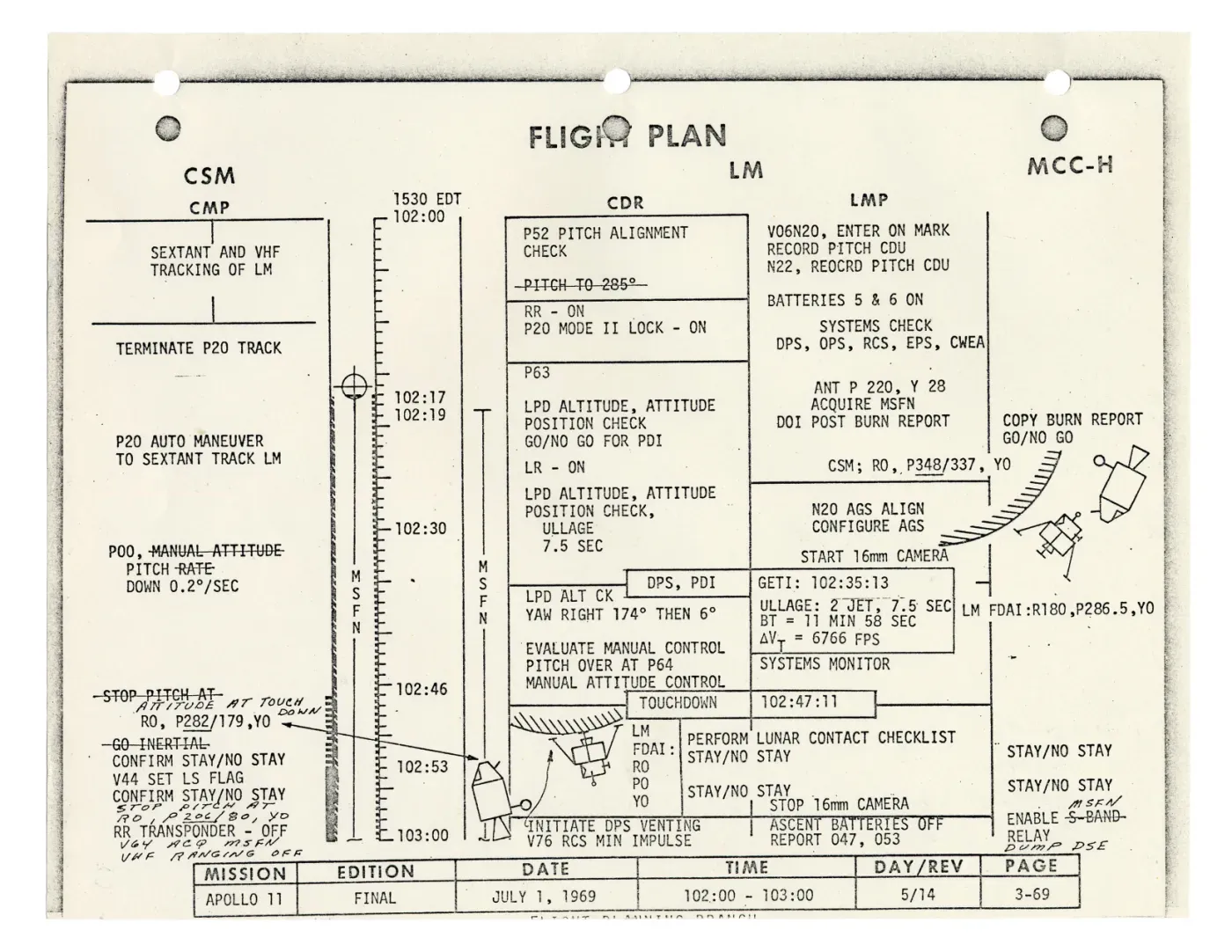
Mission paperwork treats time and state as facts worth showing plainly—every line stamped with GET Time counted from launch—the single clock every Apollo document runs on. , every column a crew station, the whole descent reduced to something you can read at a glance (NASA Manned Spacecraft Center, 1969). The colophon’s rebuild time and the moon-phase glyph in the footer are small echoes of that: real readings, not ornament.
Then there’s time, which I chase from both ends. The analog end is watches—a mechanical movement keeping time through hundreds of parts in sequence, the kind of functional object you appreciate more the longer you carry it. The one I keep coming back to is the Omega Speedmaster Professional 2Buzz Aldrin wore his on the lunar surface—hand-wound, no battery to die a quarter-million miles from the nearest watchmaker., the Moonwatch: legible at a glance, honest about what it’s doing, and built to be read—the same things I want from a page.
The digital end is a PTP A scheme for synchronizing clocks across a network to sub-microsecond accuracy. grandmaster clock I built on a Raspberry Pi, following Jeff Geerling, to hand precise time to everything on my home network. Same fixation, different century—and it lands on the page as plain exactness: dates render as YYYY·MM·DD, sortable and unambiguous; numbers use tabular figures so columns line up; navigation and tags are set in small caps; and the site’s mark is a reticle, meant to read like an instrument, not a logo.
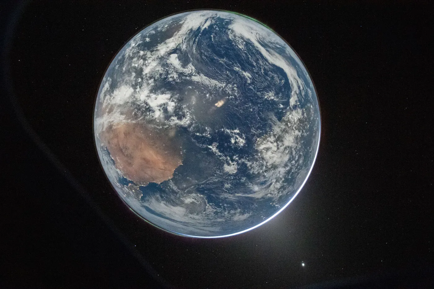
None of this is nostalgia. The same instinct is in flight right now—Artemis II sending home the same blue marble Apollo first brought back (NASA, 2026)—and the site keeps its own small version of the habit, down to the moon-phase glyph in the footer and the UTC stamp on every build.
How that shows up on the page
On a wide screen the text holds to a fixed measure The width of the reading column—capped here at about 65 characters, no matter how wide the window gets. ; any extra width becomes margin, never longer lines. That margin is a real column rather than padding, which is where the asides live, aligned to the sentence that earned them. 3Like this one. On a narrow screen there’s no room for a margin, so a sidenote folds back inline behind a tap—same note, different width, and no JavaScript doing the work. A single dark-red accent carries everything that needs emphasis: a link under the cursor, a sidenote number, the best value in a table. Keeping it to one color is what stops the page from turning into a set of competing signals.
Underneath all of it run a couple of book-typography habits. Numerals in running prose are old-style—they sit low and tall like the letters around them, the way a 3 or a 7 drops below the line, instead of standing as uniform slabs; tables switch back to even, tabular figures so columns still align. And punctuation is set to hang, so a line that opens with a quotation mark—the Dude up top, say—lets the mark slip into the margin and keeps the text edge optically straight.